
Guide To Accessible AEM Forms
In this document we review the 4Point Guide to Accessible AEM Forms. Discussing the Americans with Disabilities Act (ADA), which mandates accessible online content and website forms, guided by the Web Content Accessibility Guidelines (WCAG), detailing compliance methods, including implementation in Adobe Experience Manager (AEM) Forms.
Author: Aeisha Vyas
Introduction
In 1990 the United States of America introduced The Americans with Disabilities Act (ADA) which requires an organization's online content to be accessible to all users, along with forms on their websites including those who use assistive technologies. The ADA Act refers to a set of guidelines outlined in Web Content Accessibility Guidelines (WCAG) that serves as a guide for anyone building an ADA compliant website. This document describes in detail WCAG guidelines that makes a form ADA compliant and how it can be achieved in Adobe Experience Manager Forms (AEM Forms) Forms.
General Recommendations
There are three levels of compliance with the accessibility standards for websites and web applications: level A, AA, and AAA, according to the WCAG.
- Level A covers the most important accessibility factors for the greatest number of people, making it a crucial first step. At this conformance level there will likely still be some accessibility obstacles in the web content.
- Level AA goes a step further in making web content accessible to users in a broader range of contexts. This is why the majority of accessibility experts, including us, recommend this level of conformance.
- Level AAA is the highest possible conformance level in the WCAG, requiring organizations to meet the highest accessibility standards. At this level of conformance, the online content meets all Level A, Level AA, and Level AAA success criteria.
Conformance at higher levels indicates conformance at lower levels. For example, by conforming to AA, a Web page meets both the A and AA conformance levels.
WCAG Guidelines
The purpose of WCAG is to define how to make web content more accessible to people with disabilities. The first version of WCAG was published in 1999 as WCAG 1.0, however, there is a new update available called WCAG 2.2 which has added improvements for users with low vision, and users with disabilities on mobile devices.
WGAC 2.2 guidelines are classified into 5 broad categories described in the following sections.
Perceivable
The WCAG Guidelines explains how information and interface elements need to be presented to users in a way that they can understand. It can be achieved by;
Text Alternatives
- Use of text alternatives for any non-text content. (Level A)
- Controls or inputs must have a name that describes its purpose. (Level A)
- Alternative forms of CAPTCHA are used to accommodate different types of sensory perception. (Level A)
- Non-text content if used for purely decoration purposes must be ignored by the assistive technology. (Level A)
Time-based Media
- Provision of alternatives for time-based media like pre-recorded audio or video (except when the audio or video is a media alternative for text and is clearly labeled as such), for example, captions must be provided for a pre-recorded audio, or an audio track must be provided for a pre-recorded video. (Level A)
- Pre-recorded captions for all pre-recorded audios. (Level AA)
- Captions are provided for the live media or an alternative that presents equivalent information for a live audio-only content. (Level AA)
Adaptable
- Content does not restrict its view to a single display orientation, such as portrait or landscape, unless a specific display orientation is essential. (Level AA)
- Content must have a correct reading sequence. (Level A)
- Proper description of the input field to understand its purpose, for example name field must announce “Full name” when read using assistive technology. (Level AA)
Distinguishable
- Proper use of color to indicate an action. (Level A)
- There should be sufficient color contrast between foreground and background, this includes texts on images, background gradients, buttons, and other elements. To achieve Level AA conformance, contrast ratio must be at least 4.5:1. (Level AA)
- Option to resize text up to 200% without losing the content. (Level AA)
- The background sounds must be at least 20 decibels lower than the foreground speech content. (Level AAA)
Operable
User interface components and navigation must be operable.
Key Board Accessible
- All functionality of the content is operable through a keyboard interface. (Level A)
- If using keyboard shortcuts, a mechanism must be available to turn off the shortcut, to remap the shortcut including non-printing characters (e.g., Ctrl, Alt, etc.) (Level A)
Enough Time
- Provide users enough time to read and use content or at least allow them to turn off, adjust or extend the time limits. (Level A)
- Timing is not an essential part of the event or activity presented by the content, except for real-time events. (Level AAA)
- Interruptions can be postponed unless it involves an emergency. (Level AAA)
- On expiry of the authenticated session user can continue without loss of data. (Level AAA)
Seizures and Physical Reactions
- Content design must consider known compositions which can cause seizures or other physical reactions. For example, web pages should avoid flashing content. (Level A)
- Use of motion animation must be disabled unless essential for the functionality. (Level AAA) • Web pages and its sections must have titles to describe the topic or purpose.(Level A)
A user must be able to skip repeatable blocks of content. (Level A)
Logical and meaningful navigation must be followed on a web page. (Level A)
The purpose of an associated hyperlink must be clearly defined. (Level A)
- More than one way is available to locate a webpage, except when the webpage is the result of a step. (Level AA)
- Headings and labels describe the topic or purpose. (Level AA)
Single pointer functionality must be used unless multipoint gesture is essential. (Level A)
- Abort or undo options must be available to undo a function after completion. (Level A)
Functionality offered through motion must also be available by another mechanism to allow users who may be physically unable to perform the necessary movement. (Level A)
- Target sizes are large enough for users to easily activate them. (Level AAA)
- Users should be able to switch input mechanisms at any point should the user determine that certain tasks and interactions are more easily accomplished by using an alternative input mechanism. (Level AAA)
Understandable
Information and the operation of the user interface must be understandable.
Readable
- Language of the web page and its passages must be identified correctly so that assistive technologies can render text more accurately. (Level A)
- The human language of each passage or phrase in the content can be programmatically determined except for proper names, technical terms, words of indeterminate language, and words or phrases that have become part of the vernacular of the immediately surrounding text. (Level AA)
- Mechanism must be available to expand on the meaning of some unusual words or abbreviations. (Level AAA)
- Easier versions of the text that require advanced reading ability must be available. (Level AAA)
- A mechanism is available for identifying specific pronunciation of words when meaning of the words, in context, is ambiguous without knowing the pronunciation.(Level AAA)
- All functionality of the content is operable through a keyboard interface. (Level A)
- If using keyboard shortcuts, a mechanism must be available to turn off the shortcut, to remap the shortcut including non-printing characters (e.g., Ctrl, Alt, etc.)(Level A)
Predictable
- Any component that can trigger an event when it receives focus must not change the context, for example forms submitted automatically when a component receives focus. (Level A)
- Ensure that entering data or selecting a form control has predictable effects as Individuals who are unable to detect changes of context are likely to get disoriented while navigating a web page. (Level A)
- Functional components which appear repeatedly within a web page, require consistent identification. This can be achieved by consistent labelling. (Level AA)
- Components that have the same functionality within a set of Web pages are identified consistently. (Level AA)
- Changes of context are initiated only by user request, or a mechanism is available to turn off such changes. (Level AAA)
Input Assistance
- If an error is identified, it must be described to the user in text. (Level A)
- Labels or instructions are provided when content requires user input. (Level A)
When an error with known corrections occurs, the suggestions should be provided to the user. (Level AA)
For web pages that cause legal commitments or financial transactions for the user, data entered must be checked for input errors or reviewed before making the submission final. (Level AA)
- Help text must be available to provide context on the action to be performed. (Level AAA)
Robust
Content must be robust enough that it can be interpreted by a wide variety of user agents, including assistive technologies.
Compatible
- Elements must use start and end tags and must have unique IDs and attributes unless the specifications allow these features. (Level A)
- Name, role and value of a form element must be programmatically set to be determined by the assistive technologies. (Level AA)
Conformance
This section lists requirements for conformance to WCAG 2.2.
Conformance Requirementsements
- One of the levels A, AA or AAA of conformance is met in full.
- Conformance (and conformance level) is for full web page(s) only and cannot be achieved if part of a Web page is excluded.
- Any information or functionality that is provided in a way that is not accessibility supported is also available in a way that is accessibility supported.
ADA Compliance with Adaptive Forms
Alternative (Alt) Text is meant to convey the “why” of the image as it relates to the content of a document or webpage. It is read aloud to users by screen reader software, and it is indexed by search engines. It also displays on the page if the image fails to load. In Adaptive Forms, the author must set alternative text under properties of the image component seen on the sidebar. Once saved alternate text will be read by screen readers to convey the information shown on the image.
It is also very important to make sure that alternate text correctly specifies the information shown in the image. For example, screen readers do not understand the difference between logos and other images, therefore for logos, the format should always be "[Organization name] logo." Implementing this achieves success criterion 1.1.1, conformance level A.
Header
A header is placed on the top of a form before introductory content. Main header is enclosed in H1 tags, with H1 being the main title of a form. Header tags can range from <H1> to <H6>, the greater the number, the smaller the tag, making H6 the least insignificant tag to use on a form. Header tags are used by accessibility tools to inform users about the hierarchy of the content to help them understand the structure of the web page.
In Adaptive Form, the author must use the “Text” component to set different heading levels in form header to define form title and company name to provide a hierarchical structure. For example;
<H1>Name of the company</H1>
<H2>Form title</H2>
In addition, Text components must also be used before each panel or a section with an appropriate heading level to create a proper hierarchy.
Implementing this achieves success criterion 1.3.1, conformance level A
Sections
Much of what drives a user’s journey through a form is in the layout and design of the Adaptive Form. Adaptive Forms offer a multitude of ways of designing forms in a way which promotes ease of navigation and a better overall user experience.
Navigation in an Adaptive Form must be sequentially setup to provide a meaningful sequence to a user when navigating through it using keyboard strokes.
In Adaptive Forms, nested sections can be used to sequentially setup form elements by using “Panel” components to define parent and children panels. Panel component lets users setup sections (as shown in the snippet) in the desired hierarchy as well as change the “Layout” property, which helps to position content within the form.
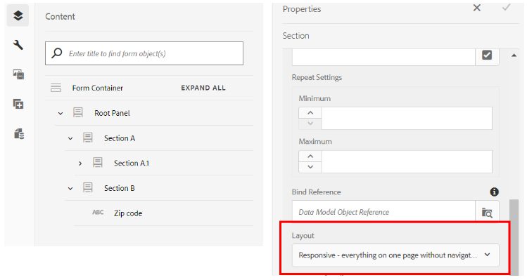
Following is the list of all the layout options available in an Adaptive Form;
1. Responsive - everything on one page without navigation.
2. Wizard - a multi-step form showing one section at a time.
3. Accordion - sections appear as a collapsible box stacked beneath each other.
4. Tabs on Left – sections as tabs appear on the left.
5. Tabs on Top - sections as tabs appear on top.
We recommend using Wizard or Tabs on Top layouts for the parent panel along with “Next” and “Back” buttons in each section for easy navigation, so that the flow of the form is more predictable. In case the form requires multiple layers of nested panels, Wizard or Tabs on Top layout can be used along with Tabs on Left or Accordion.
Implementing this achieves success criterion 1.3.2, conformance level A.
Labels
A label can communicate to users what content is about. A label can be used to describe a section of a form or a field inside a form. It is therefore important to provide meaningful labels to identify what a form component represents. In many cases, the visual label is not sufficient in explaining the purpose of the field, which in these cases the screen readers caption will be more specific. For example, for a date of birth field, Screen reader should read, “Enter your date of birth”, instead of “date of birth”.
In Adaptive Forms, labels for a screen reader can be set under the accessibility tab for most of the components, like Text field, Numeric field, Drop down, Check box, Radio button, Button, etc.
To use the Accessibility option, follow these steps:
- Select a component and tap on the wrench component.
- Click Accessibility in the sidebar to choose the desired accessibility option.
The list consists of the following options;
Custom Text - Form authors provide the content in the accessibility option “Custom text” field. The assistive technology, such as screen readers, uses this custom text. Using the Title setting is the best option in a majority of the scenarios. Consider creating Custom Screen Reader Text only when using the Title or a short description is not possible.
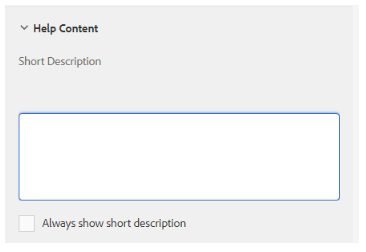
Short description - For a majority of the components, the short description appears at runtime when the user hovers the pointer over the component. You can set this option in the short description field, under the help content option. We recommend setting screen reader text to this option as it provides a descriptive detail of the form field.
Title - Use this option to let Adaptive Forms use the visual label associated with the form field as the screen reader text.
Name - You can specify a value in the “Name” field of the “Binding” tab. The name cannot contain any spaces.
None - Selecting “None” causes the form object to not have a name in the published form. None is not a recommended setting for form controls.
Implementing this achieves success criterion 3.3.2, conformance level A and 2.4.6, conformance level AA.
Colour Contrast
Accessibility design involves considering additional guidelines for color usage. Form authors can use colors to improve the appearance of forms, by highlighting various form components. However, an improper use of color may make a form difficult or impossible to read by people with different abilities.
Users with vision impairment rely on a high contrast between text and the background to read digital content. Without sufficient contrast, a form can become difficult, if not impossible, to read for some users. It is recommended to choose either a dark foreground color on a light background color, or vice versa.
As per WGAC the visual presentation of text and images of text must have a contrast ratio of at least 4.5:1 to achieve AA level conformance, for example, header in the form below is using white color for font on a dark background with a contrast ratio equal to 10.92:1, hence providing AAA conformance to WCAG.
Implementing this achieves success criterion 1.4.3, conformance level AA.
Error Detection
Error detection in accessible forms is important to ensure that users can easily identify and correct errors. There are two main ways for detecting errors;
- Dynamically as the user fills out a form, or,
- When a form is submitted
Authors can achieve accessible error detection in Adaptive Forms by using the following out-of-box properties;
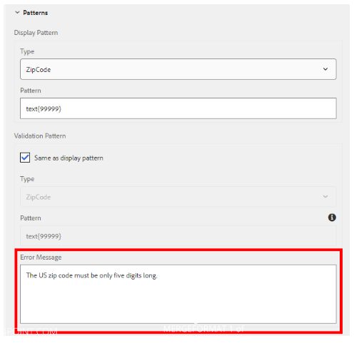
1. Providing descriptive “Error message”
This property can be used to detect errors when a user is filling a form. For example, author can set a validation pattern (as shown in the snippet) and provide an error message that will show when zip code value fails the desired validation.
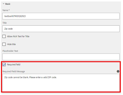
2. “Error message” on submission
For mandatory/required fields that must have a value on submission, error messages can be set by supplying a descriptive "Required Field Message" as seen in the excerpt.
3. By using “Validate” event in the rule editor
For more dynamic behavior, the author can use the rule editor to add logic to Adaptive Form objects by writing rules that define actions to trigger based on conditions, user inputs, and user actions.
Implementing this achieves success criterion 3.3.1, conformance level A and 3.3.3, conformance level AA.
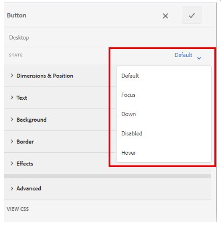
State Based Styling
To create an accessible design, it is very important to forge an intuitive design. It can be achieved if the components are styled appropriately. For example:
- a button in an Adaptive Form must be styled such that it changes color when clicked or when it is disabled,
- a disabled component must be greyed out to indicate its inactive state, etc.
In Adaptive Forms, authors can use form theme to change color and apply other CSS, with respect to the state of an object, as highlighted in the snippet below.
Implementing this achieves success criterion 2.4.7 conformance level AA, 1.4.11 conformance level AA and 2.4.13 conformance level AA.
Screen Size
Accessible forms are required to have content that does not break when scaled up to 200%, that is, up to twice its width and height. This functionality can be implemented by using Adaptive Forms as shown in the snippets below, which shows a form in its default state (at 100% zoom) vs when it is zoomed to 200%. As you can see when zoomed the components on the screen readjusted vertically without losing or breaking the content.
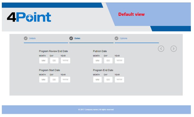
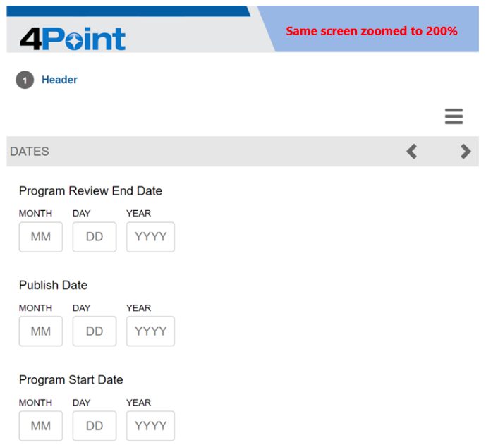
Adaptive Forms are designed to adjust to different screen sizes, ensuring that a single form fits all devices and help in achieving success criterion 1.4.4, conformance level AA.
Use of Adobe Sign
As per Adobe Sign Accessibility Conformance Report (ACR) Adobe Sign is WGAC level AA compliant. It is achieved by adhering to the following criterions;
Orientation (Level AA) - content does not restrict its view and operation to a single display orientation and responds appropriately to screen orientation changes.
Identify Input Purpose (Level AA) - the purpose of each input field collecting information about the user can be programmatically determined.
Images of Text (Level AA) - the Sign experience uses text instead of images of text.
Reflow (Level AA) - content responds and reflows as necessary when zoomed and does not require scrolling in two dimensions.
Non-text Contrast (Level AA) - user interface components and meaningful graphics have sufficient contrast with the surrounding background.
Text Spacing (Level AA) - there is no loss of content or functionality when users override author specified text styles.
Multiple Ways (Level AA) - multiple ways of locating web pages are provided, such as via Search, except when the location is the result of, or a step in, a process.
Readings and Labels (Level AA) - headings and labels are descriptive.
Focus Visible (Level AA) - the keyboard focus indicator is visible on all interactive components.
Consistent Navigation (Level AA) - when navigational mechanisms are repeated in the product, they occur in a consistent relative order and appearance.
Consistent Identification (Level AA) - components with the same functionality, such as form controls with the same purpose are identified consistently.
Error Suggestion (Level AA) - the product provides suggestions to the user when input errors are automatically detected.
Error Prevention (Legal, Financial, Data) (Level AA) - changes to user-controllable data are reversible or can be confirmed before finalizing.
Status Messages (Level AA) - status messages, when provided, are presented in a way that can be pro grammatically determined and do not require that they receive focus.
Examples of ADA Compliant Form Objects
In this section we will define how to make some of the common components of Adaptive Forms accessible.
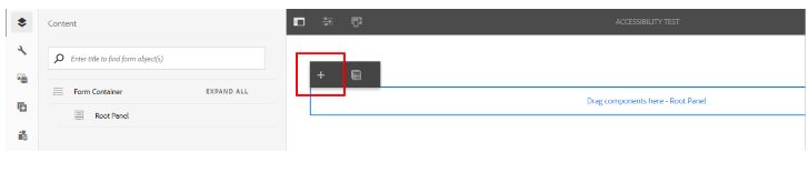
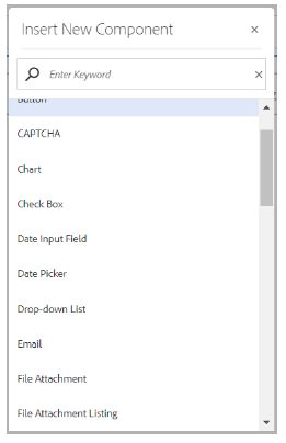
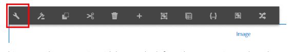
First, in order to add a component, an author must open Adaptive Form in “Edit” mode. Once you have opened a form, click on any component, and you will see a “+” button (highlighted in the screenshot below). When you click on the button it opens a “Insert new component” list and now the author can select one of the components from this list.
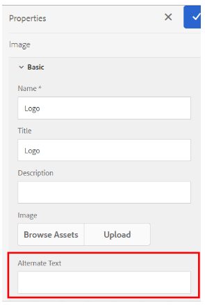
Image
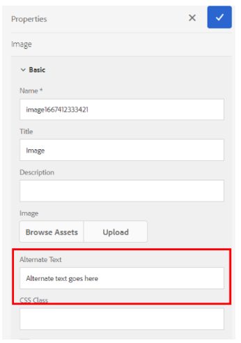
Select “Image” component from the “Insert new component” list. Now select image properties by selecting the wrench icon.
This opens the properties sidebar on the left. In the properties under “Alternate text”, enter descriptive text explaining the contents of the image. If the Image is a logo, then enter “Logo XYZ company”, otherwise type in text to provide a description of the image and capture any text in the image. This text will be read by the screen reader when the image is selected.
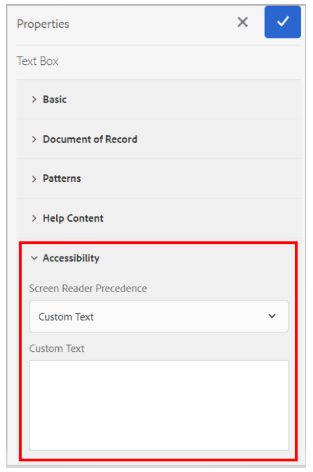
Text Box
Select “Text Box” component from the “Insert new component” list. Now select text box properties by selecting the wrench icon.
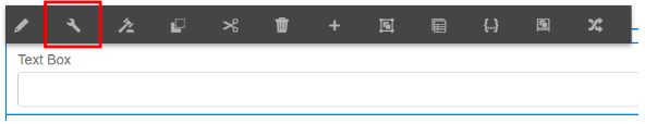
This opens the properties sidebar on the left. Under the Accessibility tab, if required add more description about the text box using the “Screen Reader Precedence” field.
Screen readers look for the selection under the “Screen Reader Precedence” field and based on the selection it looks for the text to read. One can use custom text, short description, title or name option; however, we recommend using short description as in most cases this provides sufficient description to meet WCAG standards. To enter “Short Description”, go to the Help Content tab, right above the Accessibility tab and enter a short description in the field and hit save.
Make sure that you have selected the “Short Description” option from the Screen Reader Precedence drop down.

In some cases, if Short Description is not sufficient to provide proper details/ context of the field then we recommend using Custom Text. This can be done by selecting the “Custom Text” option from the drop down and then entering the descriptive text in the Custom Text box.
Note: A rich text enabled text box fails the accessibility test with Accessible Name & Description Inspector (ANDI) therefore it is not recommended to use rich text.
Numeric Box
Select “Numeric Box” component from the “Insert new component” list. Now select text box properties by selecting the wrench icon.
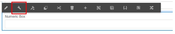
This opens the properties sidebar on the left. Under the Accessibility tab, if required add more description about the text box using the “Screen Reader Precedence” field.
Screen readers look for the selection under the “Screen Reader Precedence” field and based on the selection it looks for the text to read. One can use custom text, short description, title or name option. However, we recommend using “Short Description”, as in most of the cases this provides sufficient description. To enter Short Description, go to the Help Content tab, right above the Accessibility tab and enter a short description in the field and hit save. Make sure that you have selected the “Short description” option from the Screen Reader Precedence drop down.

In some cases, if a short description is not sufficient to provide proper details/context of the field then we recommend using custom text. This can be done by selecting the “Custom text” option from the drop down and then entering the descriptive text in the Custom Text box.
Dropdown
Select the “Drop-down List” component from the “Insert new component” list. Now select text box properties by selecting the wrench icon.
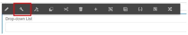
This opens the properties sidebar on the left. Under the Accessibility tab, if required add more description about the text box using the “Screen Reader Precedence” field.
Screen readers look for the selection under the “Screen Reader Precedence” field and based on the selection it looks for the text to read. One can use custom text, short description, title or name option. However, we recommend using “Short Description”, as in most of the cases this provides sufficient description. To enter a short description, go to the Help Content tab, right above the Accessibility tab and enter a short description in the field and hit save. Make sure that you have selected the “Short Description” option from the Screen Reader Precedence drop down.
In some cases, if a short description is not sufficient to provide proper details/context of the field then we recommend using custom text. This can be done by selecting the “Custom Text” option from the drop down and then entering the descriptive text in the Custom Text box.
Checkbox
Select “Check Box” component from the “Insert new component” list. Now select check box properties by selecting the wrench icon.
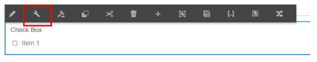
This opens the properties sidebar on the left. Under the Accessibility tab, if required add more description about the check box using “Screen Reader Precedence” field.
Screen readers look for the selection under the “Screen Reader Precedence” field and based on the selection it looks for the text to read. One can use a custom text or title option.

In some cases, if Short Description is not sufficient to provide proper details/context of a field then we recommend using custom text. This can be done by selecting the “Custom Text” option from the drop down and then entering the descriptive text in the Custom Text box.
Radio Button
Select the “Radio Button” component from the “Insert new component” list. Now select text box properties by selecting the wrench icon.
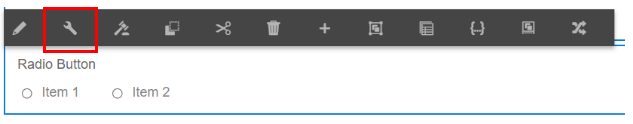
This opens the properties sidebar on the left. Under the Accessibility tab, if required add more description about the text box using the “Screen Reader Precedence” field.
Screen readers look for the selection under the “Screen Reader Precedence” field and based on the selection it looks for the text to read. One can use custom text or title

In some cases, if Short Description is not sufficient to provide proper details/context of a field then we recommend using custom text. This can be done by selecting the “Custom Text” option from the drop down and then entering the descriptive text in the Custom Text box.
ADA Compliance With Designer Forms For Output
Alternative Text
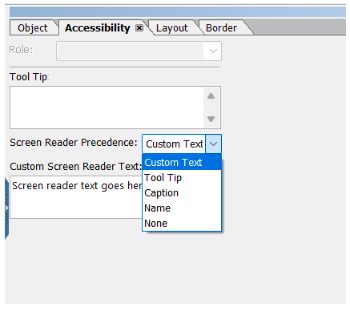
Similar to Adaptive Forms, Alternate text can be added to elements in Designer Forms (XDPs/ PDFs) using Custom Screen Reader Text under the accessibility tab and setting the Screen Reader Precedence to “Custom Text”.
Screen Reader Precedence has five options;
CUSTOM TEXT - Use this option to let the rendered PDF use the custom text associated with a form field as the screen reader text.
TOOL TIP - Use this option to let the rendered PDF use the tool tip text associated with a form field as the screen reader text.
CAPTION - Use this option to let the rendered PDF use the caption text (under field tab) associated with a form field as the screen reader text.
NAME - You can specify a value in the Name field of the Binding tab. The name cannot contain any spaces. Screen reader uses Name as the screen reader text if selected.
NONE - Selecting None causes the form object to not have a name in the published PDF form. None is not a recommended setting for form controls.
Implementing this achieves success criterion 1.1.1, conformance level A.
Forms and Section Headers
Reading levels of headers must be set correctly as the screen reader uses it to define hierarchical structure. For example, the main form heading should be set to “Heading” under role and sub headers be set to Heading levels 1 to 6.
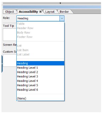
Implementing this achieves success criterion 1.3.1, conformance level A and 1.3.2, conformance level A.
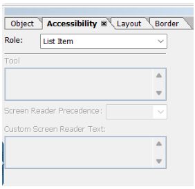
Lists
Designer Forms provide the option to tag lists and list item objects, List assigns the role of a list to the selected subform, and List Item assigns the role of a list item to the selected subform.
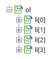
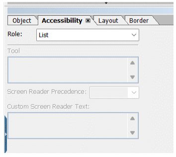
The parent subform’s role that contains all the list items, which is the subform named “ol” (refer to the snippet above) must be set to “List.”
And the subforms that contain the list items must be set to “List Item”. Implementing this achieves success criterion 1.3.1, conformance level A and 1.3.2, conformance level A.
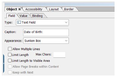
Caption
A meaningful caption must be provided for the fields to provide sufficient context under the Field tab as shown in the snippet below. In case if a more detailed caption is required, it must be captured in the custom reader text.
Implementing this achieves success criterion 3.3.2, conformance level A and 2.4.6, conformance level AA.
Colour Contrast
Similar to Adaptive Forms, Designer Form authors can use component properties as shown in the snippet to apply colors and provide sufficient contrast between text and the background. As referred in the previous section “Color Contrast”, text and images of text must have a contrast ratio of at least 4.5:1 to achieve AA level conformance.
Implementing this achieves success criterion 1.4.3, conformance level AA.
Error Detection
As described in the previous “Error Detection” section an accessible form must allow error detection to ensure that users can easily identify and correct errors. Similar to Adaptive Forms, Designer Form authors can use following ways to detect and display errors to the user;
1. Providing descriptive “Error message”
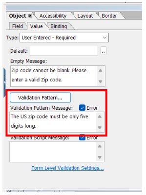
This property can be used to detect errors when a user is filling a form. For example, an author can set a validation pattern (as shown in the snippet) and provide an error message that will show when zip code value fails the desired validation,
2. Providing descriptive “Error message”
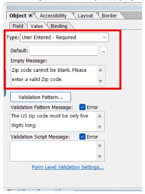
For mandatory/required fields that must have a value on submission, error messages can be set by supplying a descriptive "Empty Message" as seen in the excerpt.
3. By using “Validate” event in the script editor
For more dynamic behavior the author can use script editor to add logic to Designer Forms objects by writing rules that define actions to trigger based on conditions, user inputs, and user actions.
Implementing this achieves success criterion 3.3.1, conformance level A and 3.3.3, conformance level AA.
State Based Styling
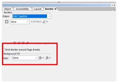
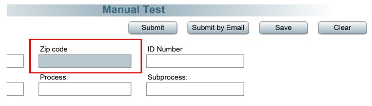
In the case of Designer Forms, an author can achieve state-based styling by using the script editor and changing the styling properties associated with a component. For example, the snippet below shows how a component’s background fill can be changed on focus.
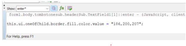
Similarly, other styling properties can be used to add styling to a component with respect to its state.
Implementing this achieves success criterion 2.4.7 conformance level AA, 1.4.11 conformance level AA and 2.4.13 conformance level AA.
Tab Order
Correct and logical tabbing is one of the important requirements to create an accessible form. It can be done using the Tab order tab on the left. Tabbing is set to “Automatic” by default which can be changed to “Custom” if automatic tabbing does not suit the requirements.
In the tab order all the form elements and their sequences show, which can be changed by moving elements up and down the sequence with a simple drag and drop
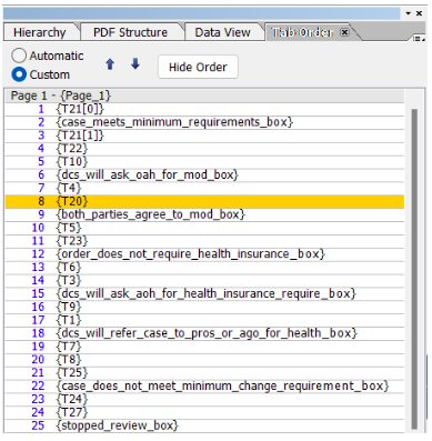
Correct tabbing order implementation is essential because it maintains a logical form's flow and ensures that it meets success criterion 2.4.3, conformance level A.
Examples of ADA Compliant Objects
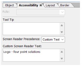
Image
Alternate text must be added to an image component under “Custom Screen Reader Text” specifying the details of the image. Such as the snippet below shows alt text added to an image which is a logo.
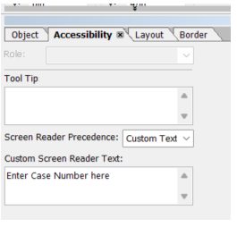
Text Field
By default, caption of a text field is read by the screen reader, but in cases when more context is required about the input field, detailed text can be added to the Custom Screen Reader Text field. The following snippet shows an example of more detailed and guiding screen reader text for the “Case Number” field, “Enter Case Number here”.
Numeric Field
By default, caption of a numeric field is read by the screen reader but in cases when more context is required about the input field, detailed text can be added to the Custom Screen Reader Text field under the Accessibility tab, similar to the Text field discussed above.
Decimal Field
By default, caption of a decimal field is read by the screen reader but in cases when more context is required about the input field, detailed text can be added to the Custom Screen Reader Text field under the Accessibility tab, similar to the Text field discussed above.
Dropdown
By default, caption and type of the object is read by the screen reader when tabbing through the drop down, for example following sample drop down will be read by the screen reader as
“Select country, Select country combo box.”
And when inside the drop down and down arrow key is pressed, screen reader will read it as
“Select country combo box 1/1, United States, Canada, Mexico.”
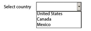
For drop downs we recommend using captions that provide proper context, or use of Custom text like in the case given above, custom text can be set to “Pick a country of your residence”, this will provide more details around required information and will be read by screen reader as
“Pick a country of your residence, Pick a country of your residence combo box.”
Checkbox
By default, the screen reader reads caption of the check box along with the state of the box (checked or not checked), for example the check box below will be read by the screen reader as;
“You are a U.S. owner of all or any portion of a foreign trust at any time during the tax year. Complete all applicable identifying information requested below and Part II of the form, check box not checked.”

The information delivered in this case is sufficient but in cases when the caption of the check box cannot be used for reasons like, caption needs to have a floating field, it becomes essential to put Custom text which includ
Radio Button
By default, the screen reader reads the caption of the radio button along with its state (checked or not checked), just like in the case of a check box.
The information delivered in this case is sufficient but in cases when the caption of the radio button cannot be used for reasons like, caption needs to have a floating field, it becomes essential to put Custom text which includes the entire caption to effectively communicate the purpose of the radio button.
Floating Field
In Floating Fields, the displayed value is read as it is by the screen reader. If the field has no value, it is not read. This is due to the primary use of this component within a text object to display types of information dynamically and therefore it does not contain a caption.
Testing Tools
We need two types of tools to check for the accessibility of a form,
A SCREEN READER - a screen reader is a technology that helps people who have difficulties seeing to access and interact with digital content, like websites or applications via audio or touch. The main users of screen readers are blind or have very limited vision.
ACCESSIBILITY EVALUATION TOOL - this tool allows authors to make more accessible content by evaluating a form or a web page against WGAC guidelines. Further in this section we have defined tools that can be used to evaluate Adaptive and Designer Forms.
Screen Reader
We recommend using Non-Visual Desktop Access (NVDA) for screen reading as it is a free and open-source, portable screen reader. This works well with both Adaptive and Designer Forms. In order to use NVDA, download the latest version from its website https://www.nvaccess.org/download/ and follow the setup instructions.
Once setup, open your Adaptive Form in the web browser or Designer Form in Acrobat and use the “Tab” key to hear content of the form spoken aloud.
Accessibility Valuation Tool
Adaptive Forms
Adobe recommends using Accessible Name & Description Inspector (ANDI) for checking accessibility of Adaptive Forms. First you need to install ANDI as recommended on its website and save it as a bookmark.
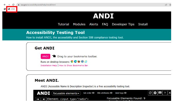
Next, open the Adaptive Form in question in preview mode. To open any Adaptive Form in preview mode, append the URL with “?wcmmode=disabled” and make sure to remove “editor.html/” from the url.
Once the form opens in preview mode (in preview mode the top AEM bar with edit and preview options must not be visible), select ANDI bookmark. This will cause ANDI to begin analyzing the form and displaying results at the top, with "Accessibility Alerts" displayed in the upper right corner of the form.
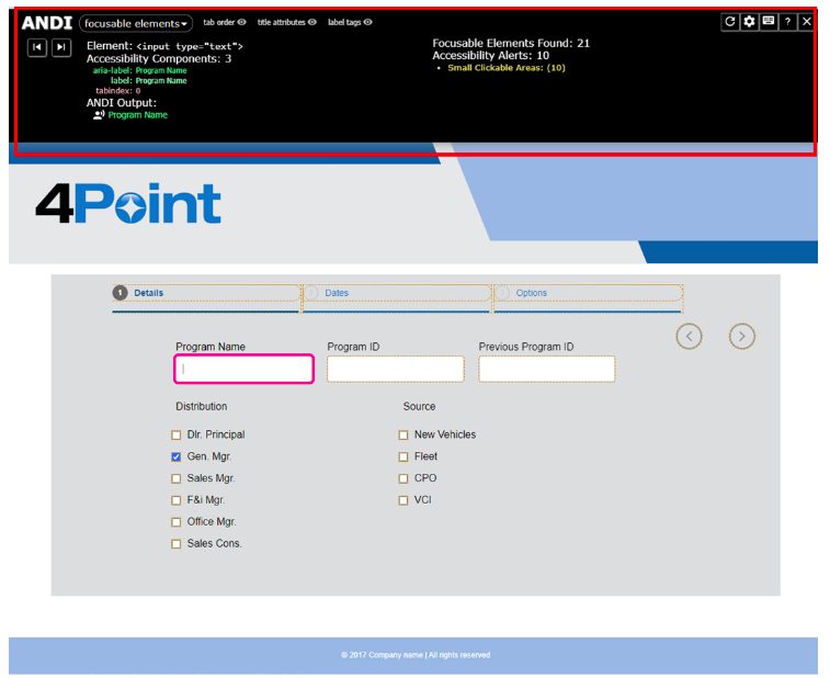
Following are the types of the accessibility alerts thrown by ANDI, which indicates accessibility issues on a web page;
1. Danger Alerts provide notification that accessibility defects are highly likely. These should be corrected to improve the page's accessibility.
2. Warning Alerts signal that screen reader inconsistencies are likely or information on the page may not be communicated consistently to all users.
3. Caution Alerts signal that accessibility issues could exist but need further investigation.
You can select the alert and it will highlight the related element with accessibility issues. ANDI also provides help for all alert types.
We recommend not having any “Danger Alerts” to make sure the form is accessible.
Designer Forms
The following is a 2-step recommended method that a developer must follow to check for Designer Form accessibility.
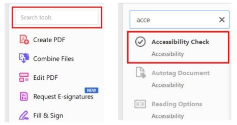
Acrobat Accessibility Checker
Accessibility checker provided by Adobe Acrobat must be used to carry out the first accessibility test by using the “Accessibility Check” option.
To use this tool, open PDF in the Acrobat, enter “Accessibility Check” in search tools field on the right pane and select it.
On the next window, select “Start checking”
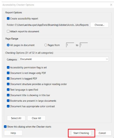
Now the checker results will appear on the left side of the screen and will show which elements passed, failed, or needs a manual check.
Go through the list of errors as we recommend making sure that there are no elements in the PDF that failed accessibility check.
Pac Tool
As a next step, we recommend using PAC 2021 which is a free PDF accessibility checker, it can be downloaded from its website https:// pdfua.foundation/en/pdf-accessibility-checker-pac.
Once downloaded and installed, you can test your Designer Forms to check for accessibility gaps. Important thing to note here is that you must first flatten your Designer Form to test it through PAC.
To flatten your Designer Form, open it in AEM Designer, under “File” option on top left, hit save as
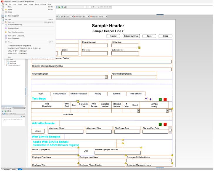
In the pop-up window, under “Save as type” select Adobe Static PDF Form (*.pdf), this will save a flat version of the Designer Form as a PDF.
Now open PAC tool and select cursor image on the PAC window (highlighted in the snippet below)
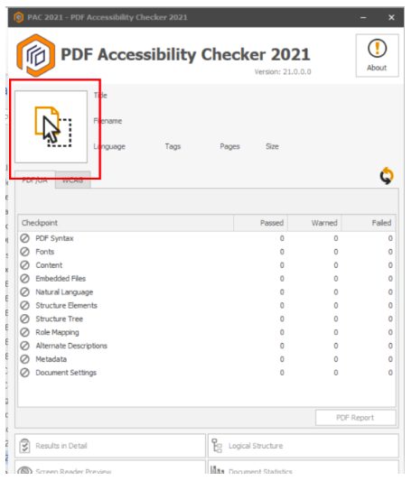
This opens a window from where you can select the flat PDF version of Designer Form created in the last step. After the PDF is selected, PAC will run a test and display results to indicate whether the PDF is accessible or not.
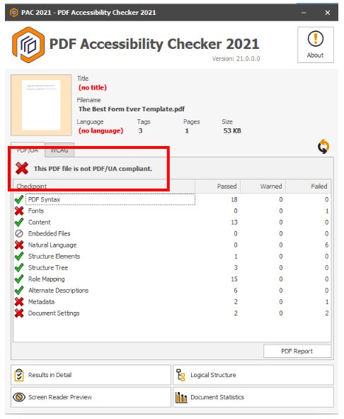
For more information on the errors, select the “Result in Detail” option at the bottom. This will indicate the exact location of the error. Go to the form element in AEM Forms Designer and fix the element in question. Now save the updated form and rerun PAC test following the steps from the start to check whether the issue is fixed or not.
Accessibility Limitations
Dialog/Modal Popup – when using modals, assistive technologies such as screen readers may face a huge barrier and could be unaware a modal dialog is displayed on the page. This causes accessibility issues as it disrupts the flow of a user's actions. While the modals overlay doesn’t allow mouse and touch users to interact with the rest of the page, keyboard users can still interact with it because keyboard focus is still there.
Rich Text – when a text field in the Adaptive Form is rich text enabled it fails the Accessibility test as the formatting options available as a link are inaccessible.
In case needed, the accessibility errors related to Dialog/Modal Popups and Rich Text can be fixed by altering the default HTML structure of an Adaptive Form.
Appendix
Other Useful Materials
https://www.accessibility.org.au/guides/what-is-the-wcag-standard/
https://www.w3.org/TR/WCAG21/#intro
https://www.adobe.com/accessibility/compliance/adobe-sign-2020-01-23-acr.html
https://www.section508.gov/training/web-software/andi-training-videos/overview/
4Point, more than just a service provider; we're your strategic solutions partner helping you navigate your digital journey. From consultation through implementation to ongoing care, our comprehensive approach ensures that your experience with digital document processes is not just efficient, but truly transformative.